


inDesign Designs
Here is a selection of my 3 favorite designs completed throughout the semester. Click on the picture to view the full image
Design 1
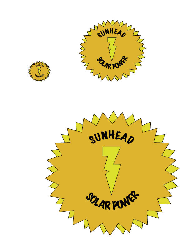
For this logo design I chose a star shaped logo with contrasting colors. I duplicated the layers and rotated that star shape and changed its color to further add contrast. The client wanted to have a logo that was able to be printed in black and white so it was important to have color contrast in order to see the differences. I chose simple yet effective text for the name brand that would "pop" against the yellow background and created a lightening bolt with the pen tool to add something else to the logo.
Design 2
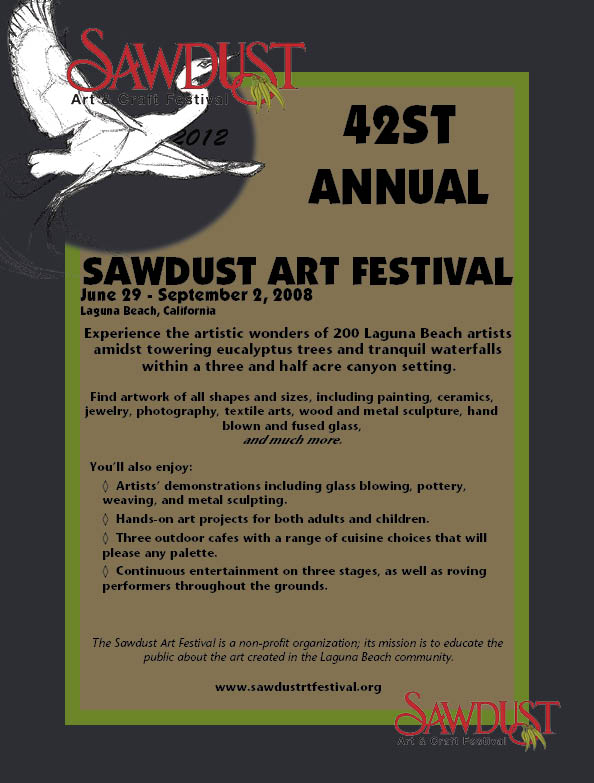
For this assignment we were tasked to use the existing colors from the company's website to be the basis for our color scheme for the ad. Then using Photoshop I created my own logo specifically for the art festival using a picture of a bird and the existing Sawdust Logo. I then used the Sawdust logo at the bottom of the ad for the repetition effect so the viewer understands that it is the end of the ad.
Design 3
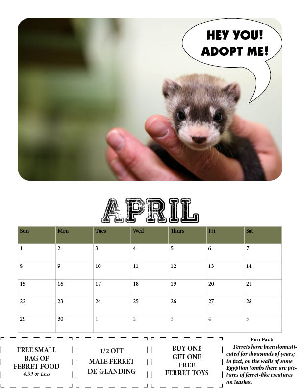
The reason I chose my design for the calendar is as follows. I chose to round the edges of the photos that I used for the top portion of the calendar to give it a softer feel, as the harsh rectangular edges didn’t fit the overall look of the calendar that I was going for. As the client desired, in order to encourage adoption, I placed text over the images that aims to persuade viewers of the calendar to go out there and adopt and animal including a speech bubble as if the animal itself was asking for adoption. I then chose to place a horizontal line the visually separated the two elements of the calendar; the picture and the calendar portion itself. Then I formatted the dates of the previous and following months in a grey so the viewer would understand that those days were not for that specific current month. Then I chose a color from the photo to use as the fill color for the days of the week row. This was a nice touch as it was a complimentary color for that month. Then I decided that the coupons should be large enough to tear off and be of a considerable size at the bottom of the dated calendar. I made four equal frames for the text so that three coupons could be added with a dashed line that could be perforated. Then the fourth box did not include a stroke, but instead included a fact about the specific animal that was included in the monthly photo.